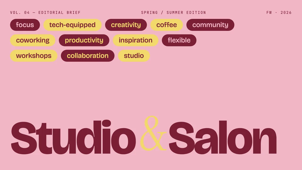
Editorial Tri-Tone
Three-color editorial system: dusty pink, mustard cream, and deep burgundy, set in Bricolage + Instrument Serif.
Slide typography serves a different operational purpose than long-form print or interface design. Presentation decks must be parsed within seconds from across a room or through compressed video streams. When every line of text shares the same typeface, size, and weight, slides flatten into unreadable blocks. Functional deck design solves this by assigning distinct responsibilities to three type classifications: display type for hierarchy, body type for narrative density, and monospace type for structured context.
In single-file HTML templates like Editorial Tri-Tone, these roles are hardcoded into clear semantic markup. Rather than relying on decorative variations, the system pairs expressive headlines with structured text. A reader immediately identifies where to focus, what supporting points follow, and where the slide sits within the larger agenda.
Display type is the visual anchor of a slide. In the gallery's downloadable single-file HTML templates, display faces are intentionally opinionated. For example, Editorial Tri-Tone uses Bricolage Grotesque, an expressive variable grotesk that commands attention at large sizes. Similarly, Emerald Editorial introduces Bodoni Moda, a heavy display serif with dramatic stroke modulation that evokes formal editorial covers.
The key to making display faces work on slides is scale contrast. Modest size differences—such as a 28-pixel headline over a 20-pixel body line—create visual indecision. Effective slide layouts employ severe scale steps, often jumping four to six times the base font size for section titles. When using Bricolage Grotesque in uppercase, as seen in the Long Table layout, the headline forms a compact graphic unit that leaves ample white space for explanatory sentences.
While display type captures attention, body type carries the argument. Body text in presentation decks must prioritize effortless scanning over stylistic novelty. Because viewers divide their attention between the speaker and the screen, line lengths should stay short and letterforms must remain open.
Templates in the gallery approach body type through two distinct typographic philosophies. Emerald Editorial pairs its dramatic Bodoni Moda display with Manrope, a wide geometric sans-serif that remains crisp at smaller point sizes. In contrast, Long Table pairs its bold display titles with Fraunces for running text, captions, and button labels, establishing an intimate editorial voice. When selecting body type for your local builds, review the general slide design guide to ensure your line heights maintain comfortable spacing.
A kicker is a small category tag or tracker positioned above a slide headline. Its job is navigational: telling the audience which chapter, metric, or workstream they are viewing. In templates such as Editorial Tri-Tone, kickers and slide metadata are set in JetBrains Mono rather than the primary sans or serif font.
Monospace typefaces are suited for kickers and slide chrome because their uniform character widths signal technical precision. When set in uppercase with tracked-out letterspacing, JetBrains Mono visually separates system-level data from narrative copy. The audience instantly recognizes that the kicker is an indexical label rather than part of the core statement.
Typographic pairing fails if the color system introduces unnecessary competition. When combining multiple type classifications, keep color applications disciplined. Restricting text to two or three high-contrast values prevents the slide from feeling fragmented.
Consider how the gallery's single-file templates balance typography with color palettes. Editorial Tri-Tone uses a strict three-color system composed of dusty pink (#F2B6C6), mustard cream (#F2D86A), and deep burgundy (#7A1F35). Headlines and body copy shift between burgundy and cream depending on the background field, maintaining sharp contrast without introducing neutral grays. Similarly, Long Table sets all typography, pill borders, and cards against warm paper (#FAF1E2) using rust-red ink (#B53D2A) and ink-deep (#8E2D1F). For more detailed layout breakdowns across our HTML templates, explore the full collection of curated slide guides.
Three-color editorial system: dusty pink, mustard cream, and deep burgundy, set in Bricolage + Instrument Serif.
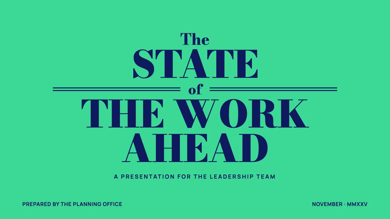
A magazine-cover business deck: emerald + navy + paper, double-rule masthead ornaments, and a bold Bodoni-style display serif.
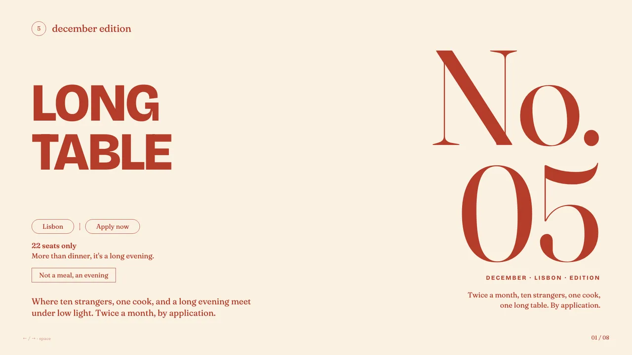
Warm cream and rust-red supper-club aesthetic with bold uppercase grotesk headlines, Fraunces serifs, and pill-shaped outlined buttons.
Using a single font for headlines, body copy, and metadata forces readers to rely entirely on size variations to decipher structure. Combining distinct typefaces—such as Bricolage Grotesque for display, Instrument Serif for body, and JetBrains Mono for metadata—creates immediate visual hierarchy that audiences can parse in seconds.
No. The gallery provides browsable, downloadable single-file HTML templates and design specifications. All slide generation, custom styling, and conversion to .pptx formats occurs locally inside your own coding agent environment on your personal machine.