Emerald Editorial
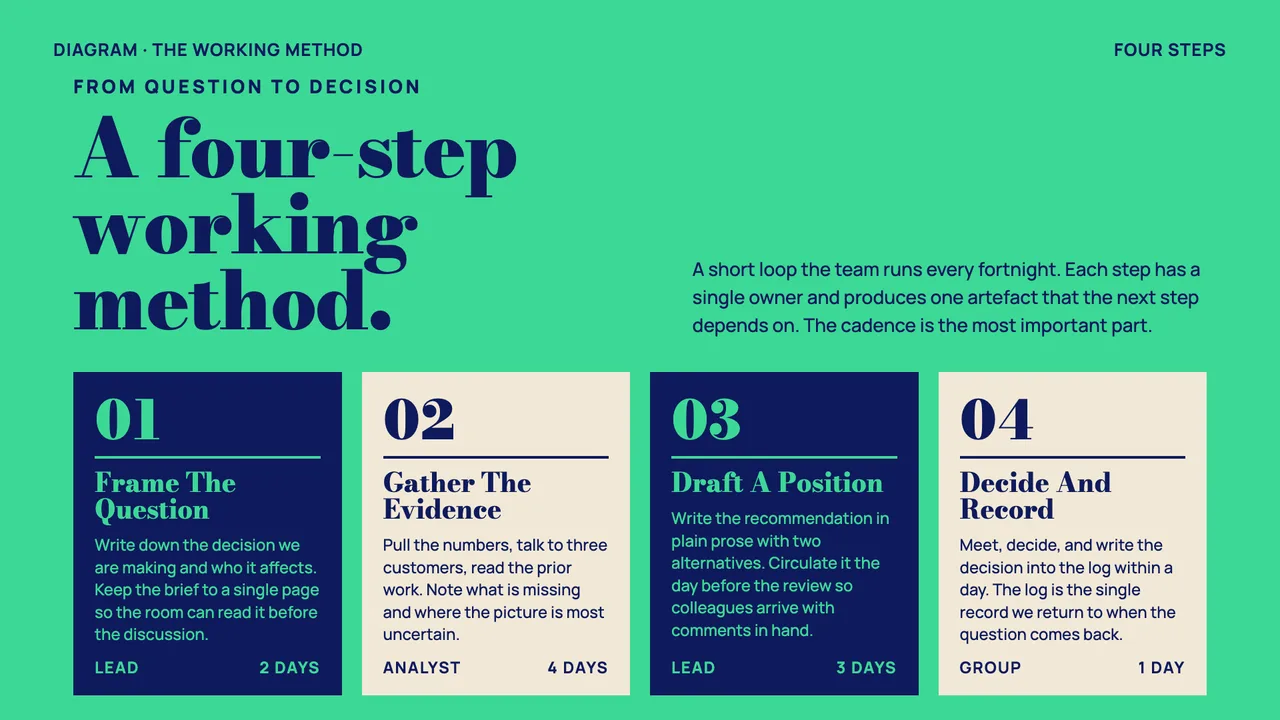
A magazine-cover business deck: emerald + navy + paper, double-rule masthead ornaments, and a bold Bodoni-style display serif.
Palette
#3CD896
#0F1A5C
#F1E9D6
vivid emerald green field, deep navy ink, and warm paper cream; high-saturation magazine-cover palette grounded by the navy
Typography
Display: Bodoni Moda
Style: heavy Bodoni-style display serif paired with a wide geometric sans for chrome and body
editorialconsideredconfidentmagazine-cover
leadership presentationquarterly reviewstrategy readoutplanning office deckexecutive briefing
Best for
Anything that should feel like the front of a serious magazine, including but not limited to leadership readouts, planning-office reviews, and strategy briefings. The double-rule masthead ornament gives it editorial gravitas without making it stiff — also a great unexpected pick for product launches or research recaps that want to feel considered rather than corporate.
Avoid for
Contexts that need to read as quiet, neutral, or institutionally restrained — the emerald field is too saturated to disappear into the background.