Long Table
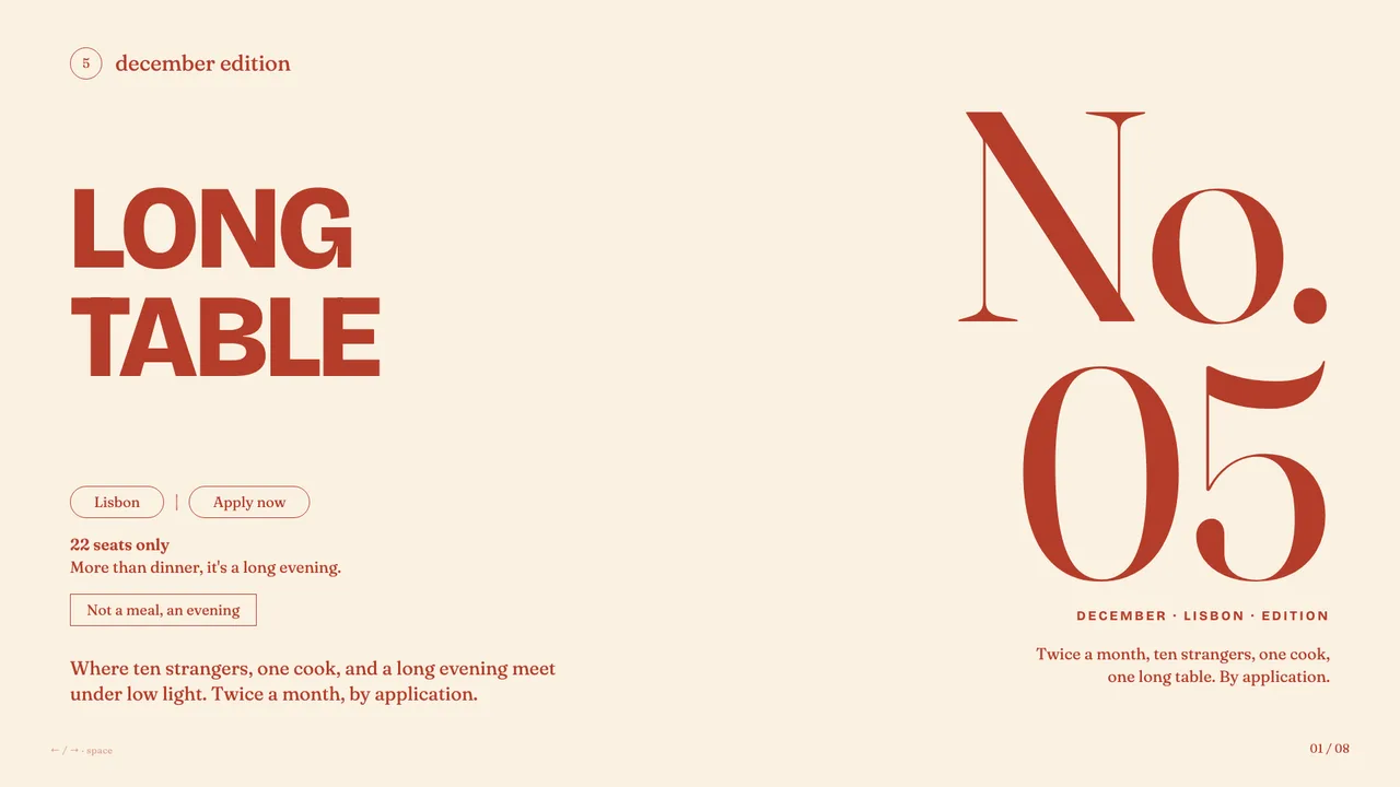
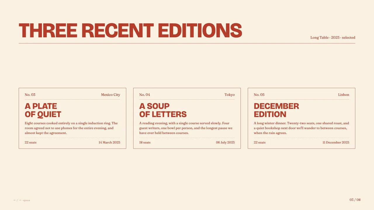
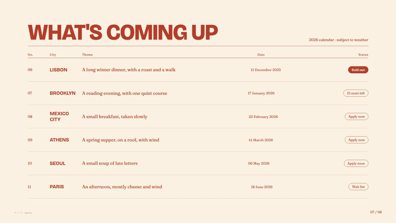
Warm cream and rust-red supper-club aesthetic with bold uppercase grotesk headlines, Fraunces serifs, and pill-shaped outlined buttons.
Palette
#FAF1E2
#B53D2A
#8E2D1F
warm buttery-cream paper with one strict rust-red / terracotta ink used for type, pill borders, and outlined info cards — strictly bichromatic, very social-media friendly
Typography
Display: Bricolage Grotesque
Body: Fraunces
Style: bold uppercase Bricolage Grotesque for hero / chapter titles paired with Fraunces for body, captions, button labels, and tagline — a contemporary mix-and-match modern editorial pairing
warmintimatemodernfriendlysmall-batchsocialhospitality
supper club or dinner seriesevent or community gatheringsmall hospitality / restaurant brandcreative studio open housemembership or subscription pitchwine or food brand cataloguemodern lifestyle brand
Best for
Anything that should feel like a warm, intimate, modern hospitality / community brand: supper clubs, dinner series, small restaurants, creative-studio events, membership pitches, lifestyle and wine brands. Equally good for any deck wanting a single warm accent colour, mixed-weight typography, and a social-media-aware modern-editorial voice.
Avoid for
Decks that need corporate polish, technical density, or a cold / minimalist register — the rust-red palette and bold serif mix are intentionally warm and people-facing.