Sakura Chroma
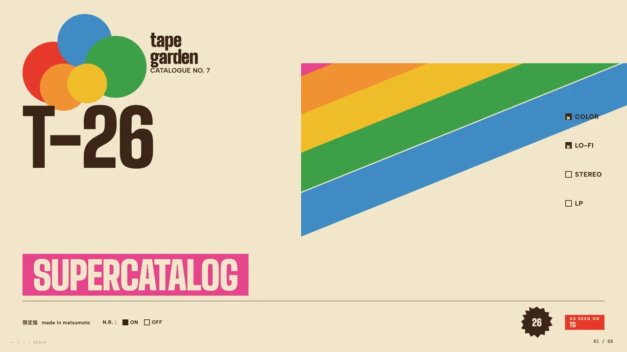
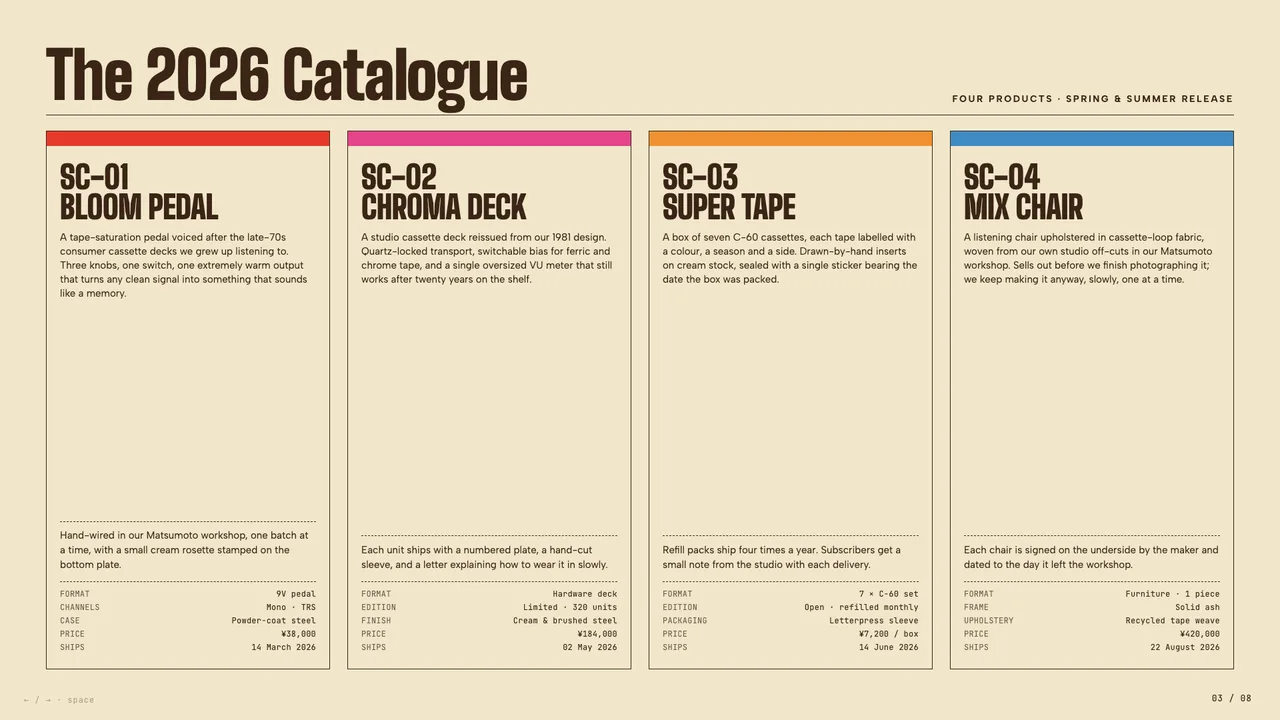
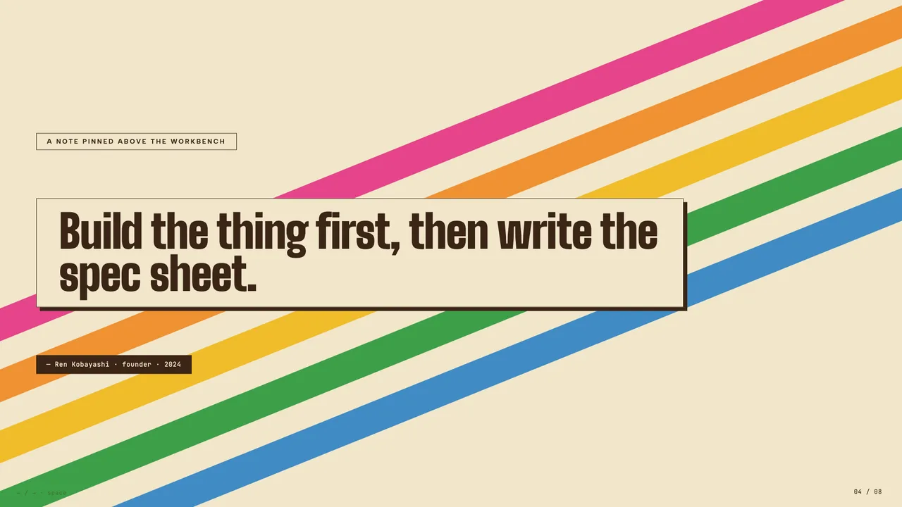
Vintage Japanese cassette-package aesthetic: cream paper, diagonal rainbow ribbons, condensed bold type, JIS-style spec checkboxes.
Palette
#F1E6CB
#3A2516
#E5392A
#E54489
#F09131
#F0BC2A
#3D9F47
#3F8BC4
warm cream paper canvas with dark warm-brown ink and a six-colour primary palette (red, pink, orange, yellow, green, blue) used as bold flat blocks, ribbons, and product-strip accents
Typography
Display: Big Shoulders Display
Body: Albert Sans
Style: condensed black grotesk display in red and brown for hero type, paired with a clean modern sans for body and a mono for spec-sheet listings; Japanese kanji used as decorative micro-type
retroplayfulkawaii-techwarmtactileproduct-catalogue
product launch or catalogueindie hardware or analog studio brandmusic label or release schedulecreative studio annual reportmagazine or zine pitchvintage-flavored brand campaign
Best for
Anything that should feel like a vintage Japanese cassette package or a TDK / Sony / Sakura Color product catalogue: indie hardware brand decks, music-label release schedules, analog studio retrospectives, zine and magazine pitches, kawaii-tech product launches, creative-studio annual reports. Equally good for any deck wanting bold colour, condensed display type, and a tactile printed-product personality.
Avoid for
Decks that need restrained, corporate, or quiet typography — the bold condensed lockups, ribbon stripes, and primary-colour palette are intentionally loud and product-page-y.