Grove
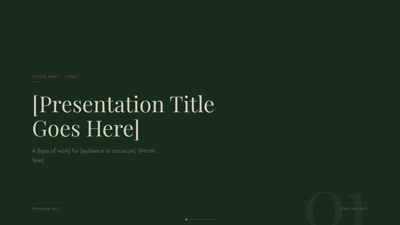
Forest-green canvas with cream type, classical Playfair serifs, and a single rust accent.
A reliable slide template does not treat color as arbitrary surface decoration. In effective presentation design, colors are assigned explicit functional jobs: canvas, paper, ink, and accent. When each color has an unambiguous purpose, slides remain legible across varying screen sizes and projection conditions without requiring ad-hoc styling adjustments on every new page.
The primary background acts as the canvas, establishing the environmental tone and baseline mood for the entire deck. Rather than defaulting to stark white, intentional templates define custom canvas tokens that soften eye fatigue during extended presentations. In the Grove template, for instance, a deep forest green `#192b1b` serves as the primary canvas, accompanied by `#1e3221` for structural cards and panels.
Typography requires an ink color calibrated specifically against the canvas. In Grove, warm bone `#d4cfbf` provides the primary ink for headlines set in Playfair Display and body copy set in Jost. Secondary tones, such as an alternate light surface `#e8e4d6`, introduce a paper mode for dense text slides. Finally, an accent color—here rust red `#c8524a`—is reserved exclusively for focal callouts, key takeaway badges, and lead metrics.
Decks that look unfocused or amateurish often suffer from palette sprawl. Authors frequently introduce five or six corporate colors across consecutive slides, believing variety keeps viewers engaged. In practice, saturated rainbow layouts split visual attention, obscure information hierarchy, and leave audiences uncertain where to look first.
Limiting a presentation system to two or three working hues creates structural discipline. When an accent appears only once or twice on a slide, viewers recognize immediately that the highlighted data point or summary sentence carries unique weight. If every card, bullet point, and icon wears a different saturated tone, color ceases to communicate meaning.
The tri-tone palette in Editorial Forest demonstrates the power of restraint. It combines deep forest green `#2e4a2a`, dusty pink `#e89cb1`, and warm cream paper `#efe7d4`, anchored by dark ink `#1a1a17` for Source Serif 4 typography. Because the dusty pink accent appears selectively against deep green and cream surfaces, every highlight feels deliberate and quiet rather than aggressive.
Visual harmony is useless if an audience cannot read your slides under sub-optimal lighting. A presentation projected in a sunlit conference room or shared over compressed video calls demands rigorous contrast between foreground text and underlying containers.
Mixed-scheme templates alternate between dark canvas slides and light paper slides to control reading pace and separate thematic chapters. In the Mat template, the dark sage canvas `#232e26` pairs with warm bone `#f0e8d2` text to maintain crisp readability on dark surfaces. For content-heavy slides, Mat switches to a light bone paper `#ede6d0` paired with dark wood `#7a4e24` typography.
A well-engineered accent must function reliably across both dark and light contexts. Mat's saturated burnt-orange accent `#c07030` delivers strong visual pop against muted green `#2e3d30` card containers while preserving clear separation against light paper surfaces. Testing your palette values across both modes prevents unreadable charts when switching slide backgrounds.
Single-file HTML slide templates organize styling through clean CSS custom properties placed directly in the document root. You do not need specialized design software or proprietary applications to inspect how a template manages color relationships. Opening the template file in any text editor reveals the exact variable mapping for canvas surfaces, typography, borders, and accents.
This transparent structure makes evaluating a design straightforward. When browsing template details or checking reference articles in our guides collection, you can inspect how tokens cascade into card components, data grids, and kicker badges. Inspecting semantic variable definitions gives you confidence that the visual hierarchy will remain intact as you add your own copy.
Slides Style Gallery is an architectural catalog and reference library, not a cloud compilation service. The website does not upload, parse, or process your presentation files online. All slide compilation, deck generation, and document export operations occur locally on your machine within your own coding agent environment.
To modify a template's colors to match your brand, download the standalone HTML file and instruct your local agent to update the CSS root properties. Swapping Mat's burnt-orange accent `#c07030` or Grove's rust red `#c8524a` for another specific tone takes seconds. Because the single-file template uses shared CSS variables across all slide layouts, changing token values in one place updates headers, callouts, and borders simultaneously without breaking component alignment.
Forest-green canvas with cream type, classical Playfair serifs, and a single rust accent.
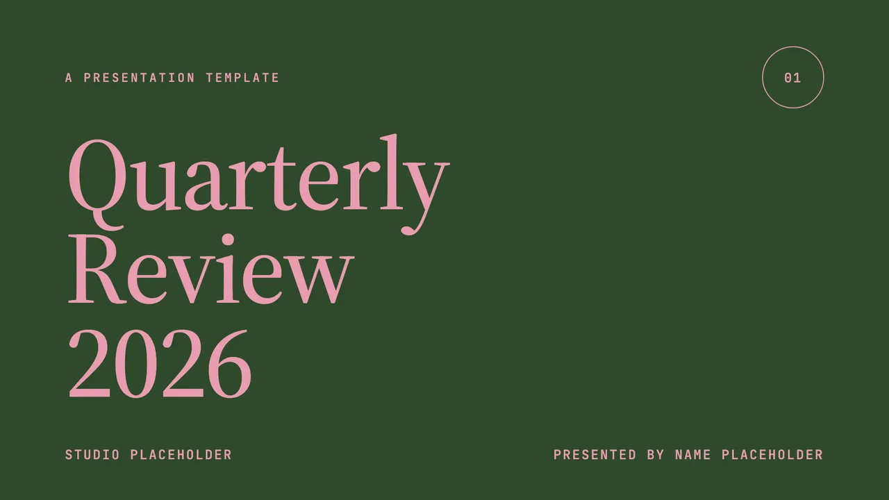
Forest green, dusty pink, and warm cream meet Source Serif 4 in a quiet, intentional quarterly-review deck.
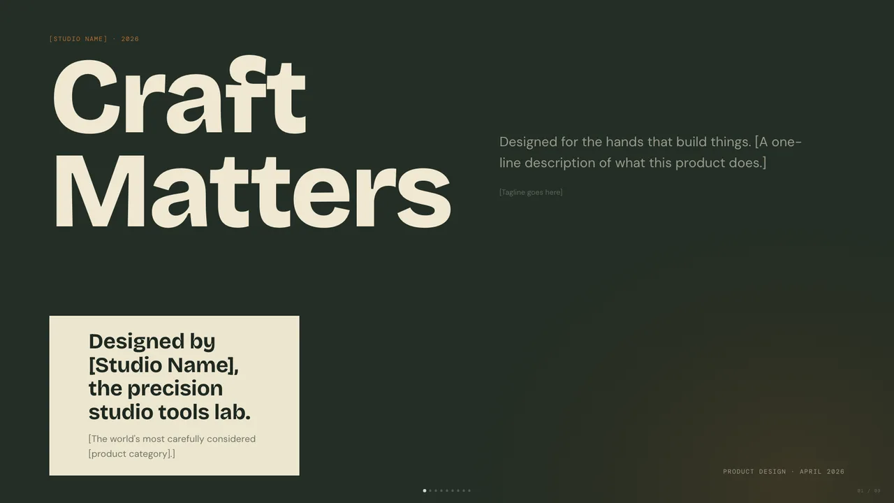
Dark sage canvas with bone paper and burnt-orange accent; mid-century modern with wood undertones.
Open the single-file HTML template locally in your web browser and inspect the elements using developer tools. Test the contrast ratio between text tokens and background values—such as Grove's bone type #d4cfbf against forest-green canvas #192b1b—to verify that body copy comfortably meets the standard 4.5:1 legibility ratio.
Yes. Open the downloaded template on your local machine and ask your coding agent to update the root CSS accent property. Because templates rely on semantic CSS variables rather than hardcoded inline values, changing the accent updates callout panels, highlight tags, and key metrics consistently across every slide.